Fixing Home surveys
In the UK homebuyers typically commission a home survey after making an offer. However, if the survey reveals significant issues and the buyer withdraws, they lose the money spent on the survey. The next interested buyer must then pay for a new survey without access to the previous one.
This leads to unnecessary repetition, added costs and a lack of transparency in the home-buying process.

Challenge
I've set myself to design a solution that gives homebuyers access to existing home survey information early in the buying process. By making this information available upfront, I aim to reduce duplicate survey costs, enhance market transparency and enable buyers to make better-informed decisions before making an offer.
The process
I approached this as a design challenge, following a classic design thinking process and applying the techniques I found most relevant to this specific case.
Just want to see the work files? View Zoopla Surveys - Case Study
Gathering home buyer insights
I conducted quantitative and qualitative research to understand the scope of the problem, get an idea of user preferences and measure the user adoption likelihood.
Quantitative insights
I ran a survey to 250 respondents aiming to:
- Validate our problem statement.
- Gauge interest in a solution where survey results are shared upfront.
- Explore user needs, concerns and willingness to pay for shared surveys.
The survey results strongly support our hypothesis that the current process of getting home survey information is inefficient, costly and in need of clarity. With one in four buyers having lost money on a home survey after withdrawing an offer, there's a clear pain point in the existing system.
An overwhelming 86% of respondents believe estate agents should share survey information with potential buyers and 53% consider it unfair to pay for a completely new survey on the same property.
58% of respondents are open to sharing their survey reports and a striking 98% would consider using a platform designed for this purpose, with more than half stating they'd use it every time they consider making an offer.
Additionally, over 70% agree that the survey process is outdated and needs improvement. While concerns around accuracy (38%) and platform trust (21%) remain, the general sentiment confirms a strong demand for more transparency.
Qualitative insights
I've interviewed 3 homebuyers to understand their pain points, needs and preferences in the home buying process.
"It was very frustrating to lose the money I'd already paid for the survey, especially because it feels like this situation could have been avoided if the subsidence issue had been clear before making an offer."
“I'd definitely check a survey before making an offer if it was available.”
“My biggest concerns would be how reliable the surveys are and whether they're still up to date.”
While one-on-one interviews provide valuable insights, they can sometimes be influenced by the interview context. Therefor I also explored online sources (eg Reddit) gathering unfiltered opinions and experiences shared publicly by a wider audience.
“I had this idea, houses need an MOT kind of thing in order to sell. The seller has a survey done by a reputable company that stays valid for a year or something.”
“My survey had a contractual requirement that it mustn't be shared with anyone. But if the surveyor works for a platform where the ownership is transferred this wouldn't be a problem.”
Competitive analysis
What solutions are out there that address this or a similar problem? I aimed to identify any remaining gaps that would justify the need for a solution.
Property portals
In the UK, Rightmove and Zoopla dominate the property portal landscape. Alongside standard details such as photos, price and floorplans, Rightmove also includes Energy Performance Certificates (EPCs) and property sale history.
Zoopla goes further offering additional insights such as property valuations, flood risk, nearby planning applications, extension potential and local crime rates.
Currently no property platform provides in-depth information about the actual condition of a property.
Applications
Inspectionary's Property Snapshot Reports offer historical condition data on properties (like roof or foundation status), but they're not traditional home inspections. They're meant for individual use and not widely shared between buyers.
in Australia, Before You Buy uses a shared-cost model for survey reports. Buyers can contribute to the cost of a report, with cashback features if enough people participate making shared inspection insights more feasible.
A few platforms are trying to solve similar or related problems but they seem to be limited by legal and practical barriers.
Other countries
In Scotland sellers are required to provide a Home Report before listing a property for sale. This report includes a valuation and survey, ensuring buyers have essential information upfront. Source: thetimes.co.uk
In France sellers must supply a set of obligatory surveys and reports known as the Dossier de Diagnostic Technique (DDT). These documents cover various aspects of the property's condition and are annexed to the sale and purchase agreement. Source: French-Property.com
Unlike Scotland and many other countries, where established systems minimise duplication, the home survey problem remains fairly unique to England and Wales.
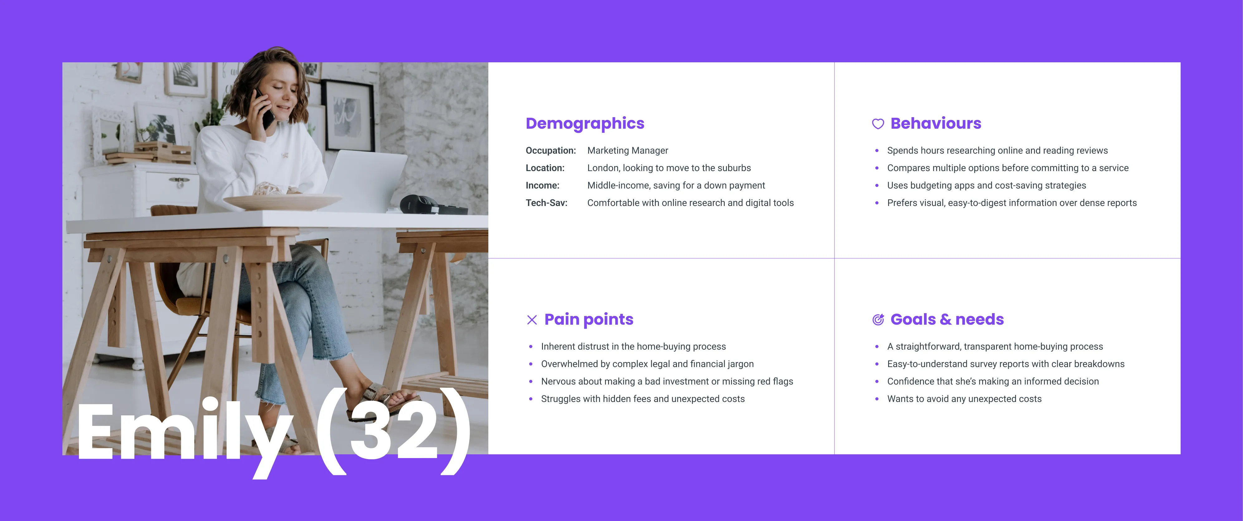
User persona(s)
I created a user persona to capture the average Home buyer and provide a clear, focused representation of their needs. While I recognise multiple stakeholders are involved (surveyors, estate agents, etc) I wanted to focus on the home buyer persona as they are the primary user and face the greatest costs and frustrations. If I were to take this project further I would likely explore the other personas as well.
Customer journey map
I mapped out the our user persona (buyers) experience to highlight their actions, the emotional state when they go through the process, the touchpoints and where and what pain points occur.
At first, I hesitated to create a journey map as I find they often mainly help as a visual aid for discussion with stakeholders and/or team members. But it's only after having a visual representation I was able to map all the pain points to make sure I understood where they occur in the process.
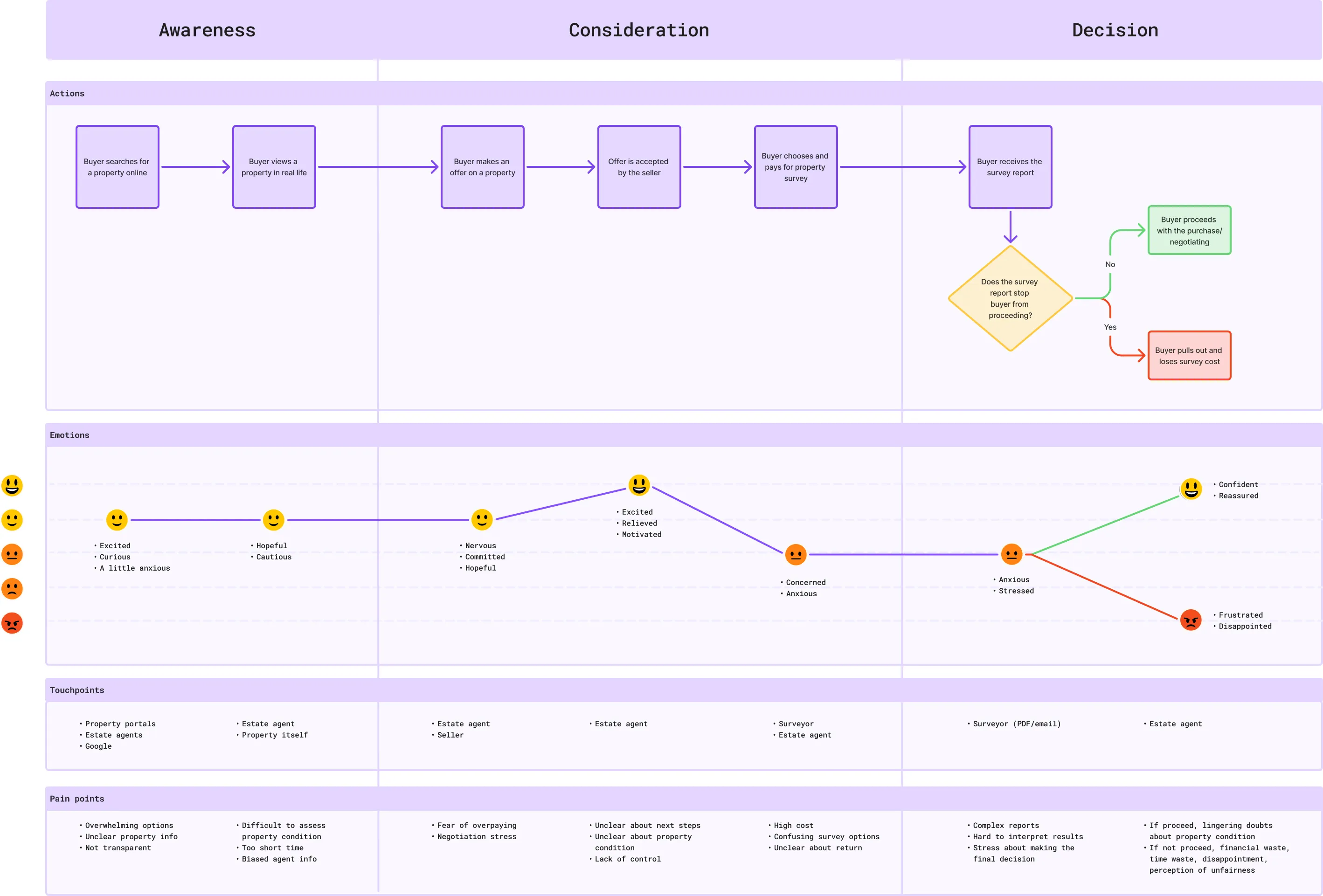
Key pain points
Based on the research, I was able to distill and prioritize the most significant insights, transforming them into key pain points.
❌ Financial waste
Financial waste due to repetitive survey costs when the same property is revisited by multiple buyers.
❌ Time waste
Without sufficient upfront information, buyers make offers only to face issues later that may force them to pull out and waste time.
❌ Inefficient process
Repeated surveys and delays add to an inefficient buying process, leading to a frustrating experience for all parties involved.
❌ Lack of transparency
There is a lack of transparency in sharing survey data, with estate agents often withholding survey results to avoid scaring off potential buyers.
❌ Perception of unfairness / distrust
There is a financial and informational burden which falls disproportionately on the buyer. This creates a perception of unfairness and an environment of distrust.
Other potential pain points emerged, though to a lesser degree.
❌ Lack of control
Buyers feel they lack control and are making decisions with incomplete information.
❌ Survey accuracy issues
There are trust issues around the accuracy and validity of shared surveys, as well as concerns about legal ramifications.
Turning pain points into opportunities
I used How Might We statements (HMWs) to reframe our key pain points into questions that might create opportunities. This helped me to inspire creative thinking and ideation.
I went through the pain points individually to allow time for deeper reflection on each pain point. I tried to focus on outcomes and impact, rather than jumping to solutions. Eventually, I used dot-voting to prioritise the HMWs that sparked the most promising ideas.
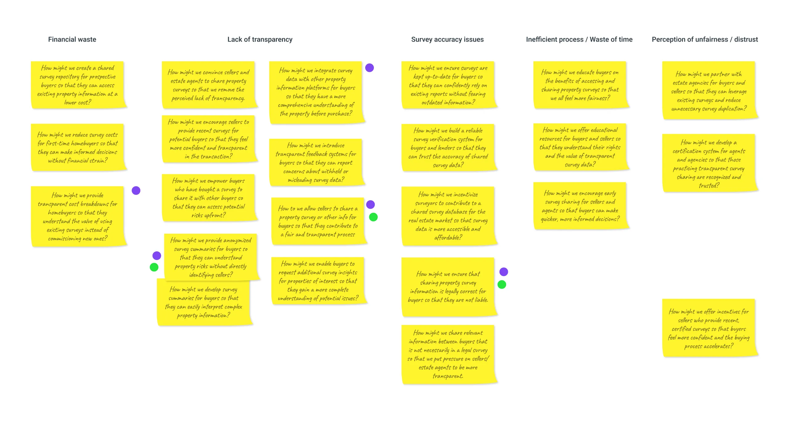
Promising ideas
I've distilled a few promising ideas that could address key pain points and which I felt excited about exploring further.
Highlight "Survey homes"
Highlight the properties that display or have added Home survey information to differentiate them from others.
Summarize reports
Add summaries or key points instead of full report information to bypass the legal liability of sharing a full survey.
Sellers rating
Give sellers or properties that share survey information a high rating to reward "transparency".
Working with constraints
Legalities
Currently sharing (and selling) home survey information has clear legal constraints. Copyright infringement could likely be bypassed if we don't copy any original text from home survey reports and rephrase it in our own words. But confidentiality might be a bigger issue. Most home survey reports include terms of engagement which state that the survey is meant only for the client's use. Sharing it could breach those terms.
Nonetheless, I see some potential solutions. One is relying on "personal reviews" from survey clients rather than sharing information directly from reports. Another could be working with sellers and surveyors so they authorise sharing or selling their surveys. Or lastly, our digital platform (eg Zoopla) could own, commission or perhaps conduct surveys themselves.
I've taken these constraints into account when ideating, trying to come up with solutions that avoid breaching them.
Zoopla vs custom platform
I approached this design challenge with an open and exploratory mindset without assuming a specific medium or solution. Initially, I was leaning towards a new platform to allow homebuyers to share home surveys directly. At this stage however, I identified that the most practical and impactful solution would likely be to enhance existing property portals. So I decided to explore both routes. I selected Zoopla as the foundation to apply and demonstrate my solutions.
Brainstorm
I used Crazy 8s to generate multiple ideas to answer some of our HMWs. I frequently use crazy 8s or a variant as it helps break mental blocks and encourages me to think beyond obvious solutions.
The time constraint can make it feel forceful and your brain is on high alert, especially towards the end, but I find it does work nearly every time to come up with fresh ideas.
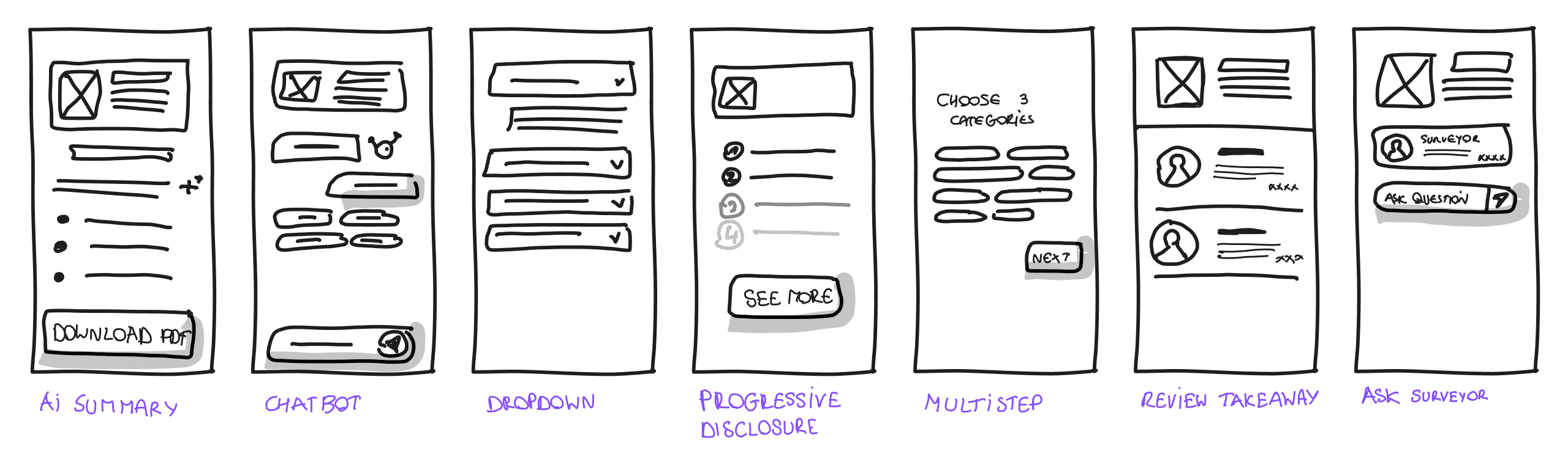
In this instance, the exercise sparked several ways to display key insights from surveys while avoiding potential legal issues. Not all ideas were feasible or practical, but they did help me think outside the box. For example, generating an AI-powered summary looked somewhat obvious at the start, but having a direct conversation with the surveyor was an interesting idea that I didn't really consider before.
I chose to add more fidelity to the some of the ideas that felt most promising to get a better sense of how they would work in practice.
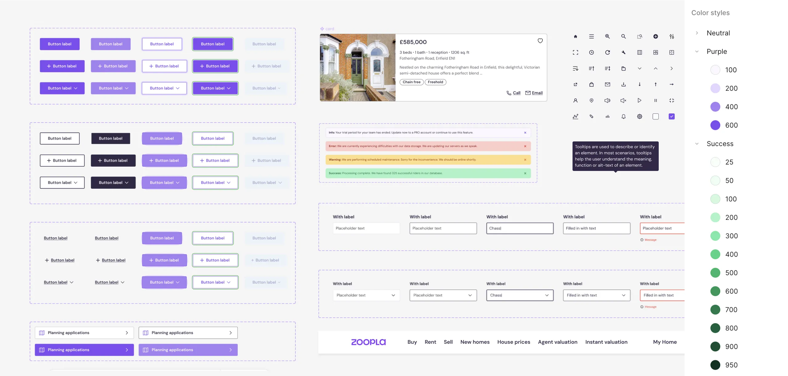
Lay your foundations
For this case study, I created a custom UI kit inspired by Zoopla's existing design language but tailored to our specific needs. This way the focus is mainly on the solution, rather than styling or (re)branding.
In most cases I prefer starting with a solid, foundational UI kit rather than designing screens at random. It ultimately saves time and gives me a dependable framework to build on to iterate.
To support this approach, I've created my own Echelon Starter UI kit
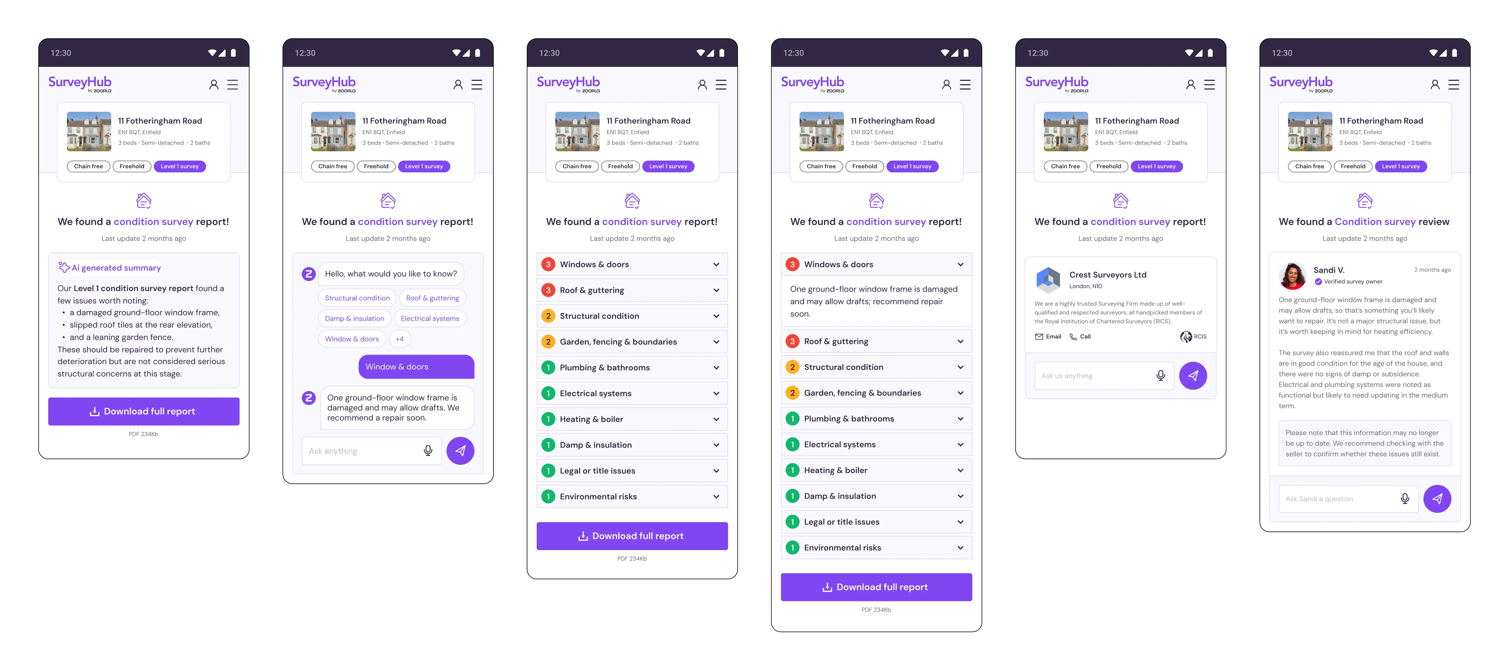
High-fidelity prototypes
Since we are not testing user flows as much, but more how users interact with elements I opted to design high-fidelity prototypes.
If time and scope allows, I always aim to prototype the most accurate representation of the final product, allowing for more realistic user testing and detailed feedback on specific features and interactions.
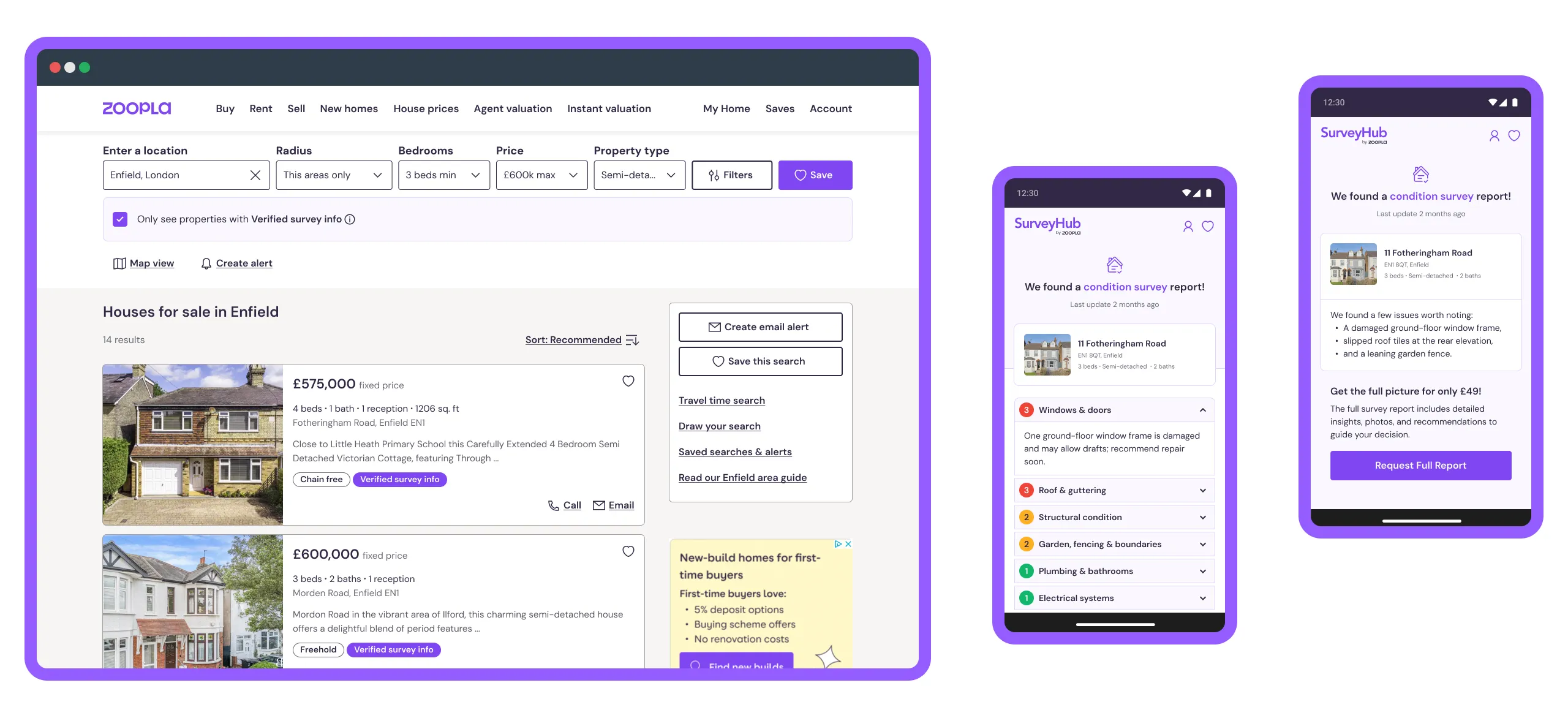
Route 1: Property portal embed
This route focuses on embedding survey information directly within the property listing page on Zoopla. The goal is to provide potential buyers with immediate access to key insights from home surveys without navigating away from the listing.
Route 2: Dedicated app
This route explores a dedicated mobile application that focuses on surveyors sharing home survey information and potential buyers accessing it. The main nuance is that this solution is aimed for users who actively seek out survey information rather than encountering it passively while browsing property listings.
Just want to see the work files? View Zoopla Surveys - Case Study
Validation
I've validated these design solutions by holding them up to my user persona and customer journey map to see if they address key pain points. I also collected informal feedback from my initial interviewees to gather their thoughts.
Overall, the feedback was positive. Maybe not surprising, there was a preference for embedding survey information directly in the property portal since it fits neatly into the existing process. One interviewee raised concerns about AI-generated content, particularly its reliability and trustworthiness.
Given time and resources, I would conduct more formal usability testing to gather data on user satisfaction.
Iterations
If I were to explore this design challenge further, I would consider the following iterations:
Level of AI highlighting
I would assess whether labelling content as AI-generated works in our favour or against us. I want to understand better if there is an actual distrust and users change their behaviour based on it.
I believe in our case AI mainly shows it's value under the surface. A LLM can interpret and summarize the survey information, which does not mean it should take centerstage in the front-end. There is a clear trend where too many digital platforms today feel the need to showcase AI everywhere and I suspect the result is saturation rather than real value.
Feature promotion lifecycle
I personally see true value in this solution, but I need to take a closer look from a business perspective to determine its priority compared to other features. Then I would likely run a feature spotlight campaign for the first two months to drive adoption and gradually integrate it in into the interface.
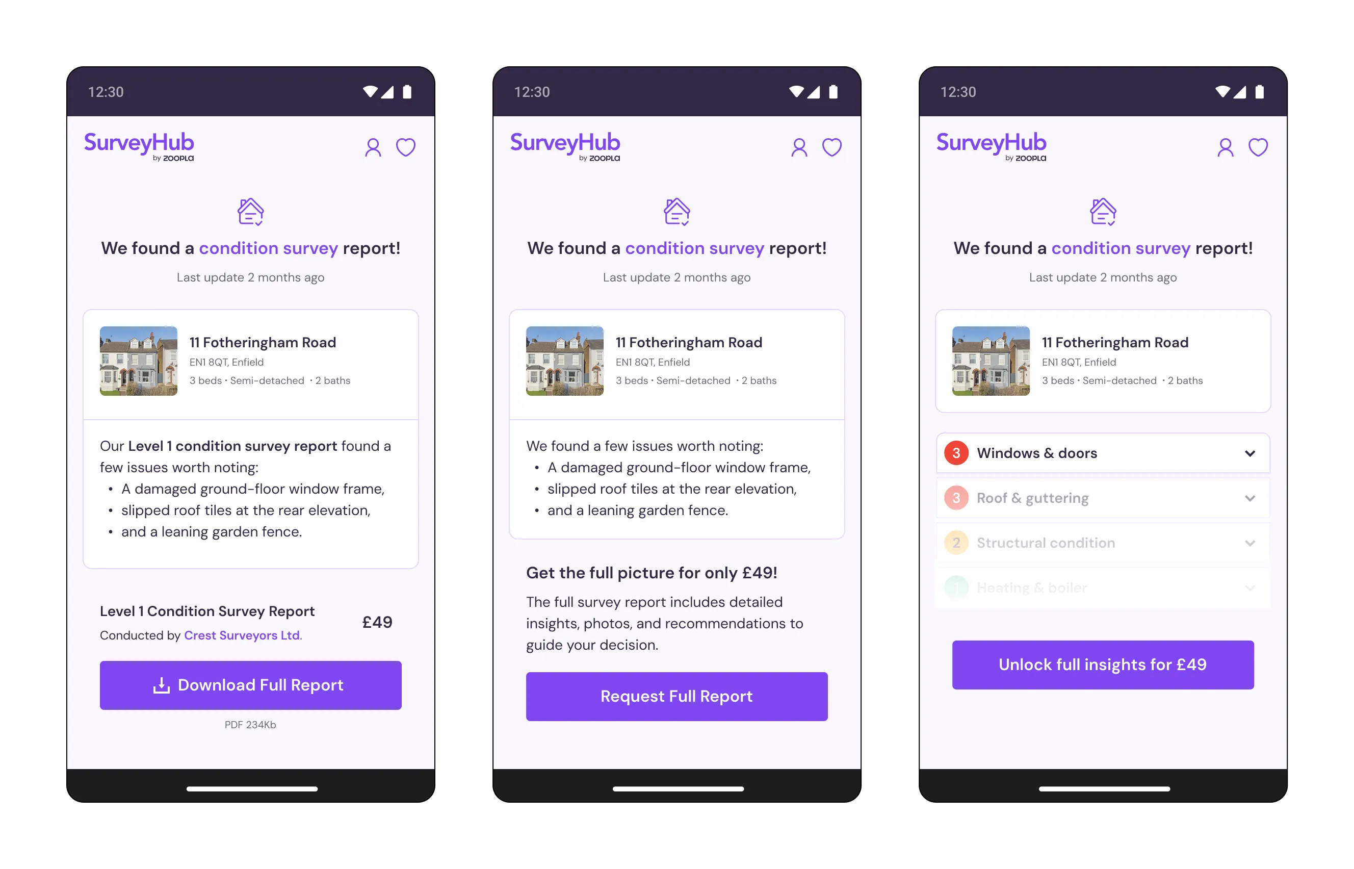
Disclose survey information
As much as I personally want the buying process to be fully transparent and open, there is a business opportunity in presenting only a survey summary upfront and unlocking full details after sign-up, subscription or payment. It creates potential for monetisation or at least lead generation. By gating the survey data it might also be seen as more valuable.
Transparency rating
I would conduct user testing to see how buyers respond to properties rated by the level of transparent survey information. Positive reactions could incentivise sellers to provide more detailed data.
What I've learned
Solutionizing
When tackling design challenges step by step, you always gain new insights while uncovering key pain points. At this stage my creative brain naturally shifts into solution-mode and I need to restrain myself from diving in too deep and jumping too far ahead. So I usually note any ideas down, but park them for the ideation stage.
Similarly I also find the process never to be truly linear. I've revisited and refined earlier stages based on new insights and ideas.
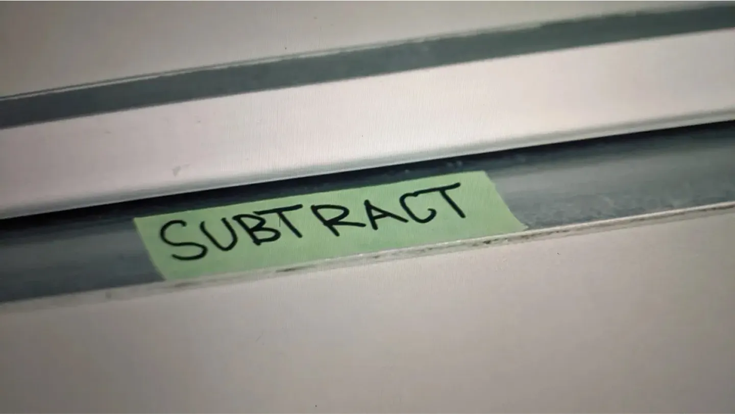
Subtract, subtract, subtract
I've recently been reflecting on simplicity (inspired by The Bear). How can I streamline my process? How can I design solutions that focus only on the most essential elements or better yet, the minimum amount of elements? Design by subtraction.
I've been reminded with this case study that it's natural to want to over-engineer at the start of the design process. For instance I felt an urge to put survey information left, right and center, but I paused and really tried to consider where the touchpoints should be.
User personas are another good example. Left unchecked, I could create dozens of personas, each with highly specific traits. But would that be useful? Probably not. The real challenge is in subtraction, distilling personas down to the core characteristics that actually drive ideation and remain valuable in later stages of the process.
Design with purpose
In a similar vein to design by subtraction is design with purpose. As product designers it's easy to see our craft as the end product, but in reality we work with insights and we draw lots of rectangles. But ultimately the product users interact with is the actual outcome. This perspective brings me to my two favourite guiding principles: effectiveness and efficiency.
It makes me ask myself: What does an animation or an icon actually contribute here? For whom do I annotate UI kit elements? Am I designing for the sake of design? or more hollisitically Who is it for and what is its purpose? Will it ever be seen or used by the right people?
That said, I deeply value pride in my craft. It's why I invest extra hours perfecting a micro-interaction or refactoring code to achieve a 100% Lighthouse score. Creating something through design can be truly satisfying and expressive.
Final thoughts
Ultimately buying a home (just like any large purchase) relies on clarity and trust from all parties. If the UK government were to set up a system where sellers shared all the key info about a property right from the start, buyers would feel more confident and likely fewer sales would fall through.
And perhaps that's the goal. By designing for transparency and trust, we're not just solving a product challenge, we're highlighting what the future of home buying should look like.
Santander's Fixing the broken chain report estimates that the UK's outdated homebuying system costs consumers and the economy at least £1.5 billion annually. They agree that disclosing better up-front information is a solution, but only one part of solving the entire home buying process.
If you have any questions or are interested to take this concept further? I'd love to hear from you.